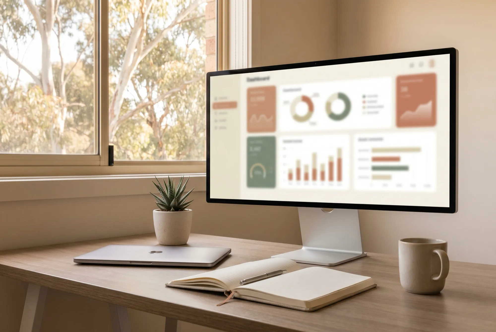
Business intelligence software pulls data from your systems, finance, sales, operations, into dashboards and reports so you can see what is actually happening without stitching spreadsheets together by hand. In plain terms, it turns the numbers you already have into a picture you can act on, ideally in close to real time rather than three weeks after month end.
That sounds simple, and the demos always look effortless. The reality is a little more interesting, because the dashboard is almost never the hard part. Let us walk through what BI does, the tools most Australian businesses reach for, and the unglamorous groundwork that decides whether any of it works.
What business intelligence software actually does
At its core, BI connects to your source systems, gathers the data into one place, and presents it visually. Instead of exporting a sales report from one app, an inventory report from another, and an accounting file from a third, then merging them in a spreadsheet at midnight, you get a single dashboard that updates on its own.
The headline features tend to cluster around a few jobs:
- Connecting to data: pulling figures from accounting, point of sale, CRM, your website, and operational systems.
- Modelling it: tidying and joining that data so a “customer” in one system matches a “customer” in another.
- Visualising it: charts, tables, and trend lines that a human can read at a glance.
- Sharing it: dashboards and scheduled reports that land in the right inbox or screen automatically.
- Drilling in: clicking a slow month to see which region, product, or salesperson moved it.
Done well, this replaces a surprising amount of manual reporting. The finance team stops being a spreadsheet factory, and the leadership team stops arguing about whose numbers are correct.
The common tools in Australia
Three names come up again and again. Microsoft Power BI is the default for many local businesses, partly because it sits inside the Microsoft 365 stack a lot of Australian offices already pay for, and partly because the entry pricing is friendly. Tableau is loved by analysts for its visual flexibility and tends to appear in larger or more data-heavy organisations. Looker, part of Google Cloud, leans toward businesses already living in the Google ecosystem and those who want reporting baked into other tools.
There are plenty of others, from Qlik to lighter dashboard apps bundled with accounting platforms. The right pick depends less on the brand and more on where your data already lives and what your team can realistically maintain. If you are mapping out your broader stack, our guide to business software in Australia is a sensible companion read before you commit to anything.
The hard part is the data, not the dashboard
Here is the bit the sales deck skips. The dashboard is the easy 20 percent. The hard 80 percent is the data underneath it: source systems that are clean, connected, and agree with each other. A beautiful chart built on messy inputs is just a confident way to be wrong.
Two problems show up almost every time. First, the same thing is named differently in different systems, so “revenue” in sales does not match “revenue” in finance. Second, nobody has agreed on what each metric means. Does “active customer” mean bought this month, this quarter, or ever? Until that is settled, two honest people can pull two different numbers and both be right, which is precisely the chaos BI is meant to end.
If two people can define the same metric two different ways, your dashboard is not finished, it has just started.
This is why BI delivers most when it sits on top of integrated systems rather than a tangle of disconnected apps. If your core platforms already share data and reconcile, the reporting layer has something solid to stand on.
Why BI loves an ERP underneath it
The cleanest BI setups usually have one thing in common: the numbers come from systems that already talk to each other. That is the whole point of an ERP, software that runs finance, inventory, and operations on a shared database so a single sale flows through to stock, invoicing, and the ledger without re-keying. If you are unsure what that means in practice, our explainer on what an ERP is covers the ground.
When BI reads from an integrated source like that, the figures reconcile by design. You are not asking the dashboard to referee a fight between three systems. You are simply visualising data that was already consistent. The same logic applies to other shared sources of truth, from a tidy CRM to a well-run document store. If your data is scattered across exports and folders, it can be worth getting help connecting your data into dashboards before you buy another licence.
How to start without drowning in charts
The most common BI mistake is starting with the tool and a wall of charts, then hoping insight appears. It rarely does. Start instead with a small list of decisions you want to make better.
| Start here | Not here |
|---|---|
| Three decisions you keep getting wrong or making slowly | Every metric you could possibly track |
| One reliable data source you trust | Ten half-connected systems |
| Agreed definitions for a handful of metrics | A vague sense that “more data” will help |
| One dashboard people actually open | A library of reports nobody reads |
Pick the decisions first. Maybe it is which products to reorder, which customers are slipping away, or whether a branch is profitable once you load it properly. Then work backwards to the few numbers that answer them, and build only those. A single dashboard that changes one weekly decision beats fifty that decorate a screen.
A note before you buy
This is general information, not personal financial or procurement advice. Software pricing, licensing tiers, and feature sets change often, so treat any figures here as a starting point and check the current details with the vendor or a qualified local adviser before committing. The right BI tool for your business depends on your systems, your team, and your budget, all of which are yours to weigh up.
The bottom line
Business intelligence software is genuinely useful, but it is a reporting layer, not a magic wand. It turns data you already have into decisions you can defend, provided that data is clean, connected, and consistently defined. Get the plumbing right, usually by sitting BI on top of integrated systems, agree what your metrics mean, and start with a handful of decisions rather than a gallery of graphs. Do that, and the dashboards stop being decoration and start earning their keep.